The Even Realities Website Design
Hi! Today I'm not here to talk about the smart glasses, I want to talk about the website instead. Even Realities is a masterclass in "Quiet Technology." It balances high-fidelity 3D product rendering with a minimalist interface. Below is an analysis of the engineering and design decisions that make this site tick.
1. Visual Design & "Tricks"
The site relies heavily on Scrollytelling to mimic the physical experience of the product. Rather than using heavy WebGL environments (which can hurt performance), they utilize pre-rendered assets controlled by scroll position.
Key Techniques & Implementation Details
1. Frame-Sequence Animation (The "3D" Scrub)
Instead of loading heavy WebGL models or jerky video files, the site uses Image Sequence Scrollytelling. This technique offers the visual fidelity of a high-end 3D render with the performance of standard 2D images.
-
The "video" is actually a series of ~60-120 individual
.webpor.jpgimages (e.g.,glass-001.webp,glass-002.webp). -
A container element is pinned using
position: sticky. -
As the user scrolls, a JavaScript listener (likely via Framer Motion
useScrollor GSAP ScrollTrigger) maps the scroll percentage (0% to 100%) to the image index (1 to 120). -
The browser swaps the
srcof an<img>tag or draws to a<canvas>instantly. -
Zero Latency: Unlike video, which struggles to "scrub" smoothly backward due to keyframe compression, images swap instantly.
-
Crisp Edges: You avoid the compression artifacts often found in streamed video, essential for showing fine hardware details like hinges.
2. Parallax & Sticky Layering
The site creates depth by decoupling the scroll speed of foreground text from background media.
- Sticky Containers: The background visual (e.g., the person wearing glasses) is set to
position: sticky; top: 0; height: 100vh;. This keeps the image locked in the viewport while the user scrolls "past" it. - Transform Translation: The text overlay is placed in a separate layer with a standard scroll behavior or an accelerated scroll speed (e.g.,
y: scrollY * 1.2). - Opacity Interpolation: As the text enters the "active" zone, its opacity is mapped to the scroll position (e.g.,
opacitygoes from 0 to 1 between scroll pixels 500 and 800).
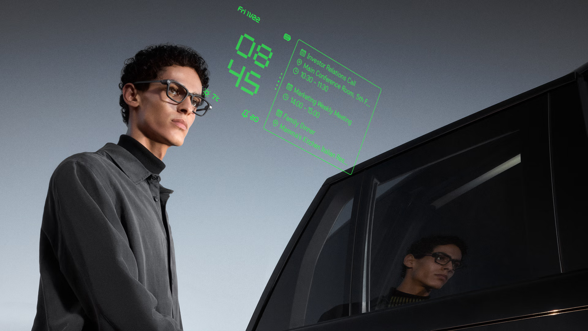
3. HUD Simulation (Compositing & Blending)
To realistic simulate the "Heads Up Display" (green text floating in the real world), the site uses CSS blending modes rather than simple transparency.
- The "Reality" Layer: A standard
<video>element plays the background footage (the world seen through the glasses). - The "UI" Layer: The green digital interface is likely an SVG or Lottie animation placed absolutely on top.
- The Trick (
mix-blend-mode): To make the digital text look like light projected onto glass, the UI layer often usesmix-blend-mode: screenorplus-lighter. This tells the browser to add the pixel values of the green text to the background video, making the black parts of the UI layer perfectly transparent and the green parts appear to "glow" or interact with the light behind them.
2. The Frontend Architecture
The application appears to be built using a modern React stack, likely leveraging Framer for its seamless design-to-code pipeline.
| Category | Technology | Reasoning |
|---|---|---|
| Framework | React | Component-based architecture allows for reusable UI elements across the "Tech" and "Store" pages. |
| Animation | Framer Motion | Handles complex layout transitions, scroll-triggered events, and the smooth "spring" physics on interactive elements. |
| Styling | CSS-in-JS / Styled Components | Likely used to scope styles dynamically based on the active theme (Dark Mode vs. Light Mode sections). |
| Commerce | Shopify (Headless) | Handles the cart and checkout logic while the frontend maintains the custom brand experience. |
3. Core UI Components
The site prioritizes components that reduce cognitive load while maximizing information density.
The Sticky Feature Switcher
One of the standout components is the sticky navigation bar found on the product detail pages.
- Context Retention: It keeps the user anchored while changing the visual context (e.g., toggling between "Teleprompt" and "Translate" views).
- Reduced Friction: Users don't have to scroll up and down to compare features; the content changes in place.
The "Testimonial" Carousel
A horizontal slider used for social proof.
- It breaks the vertical scrolling rhythm, inviting horizontal interaction.
- It conserves vertical screen real estate while showcasing multiple high-profile reviews.
4. Accessibility & Inclusivity
Despite the heavy visual focus, the site maintains key accessibility standards.
- Semantic HTML: Interactive elements (like sliders and toggles) appear to use proper ARIA labels, ensuring screen readers describe the function ("Next Review") rather than the icon ("Arrow Right").
- High Contrast Typography: The strict Black & White color palette ensures text is legible against the background, meeting WCAG contrast ratios.
- Reduced Motion: The animation library (Framer Motion) allows the developers to respect the user's
prefers-reduced-motionOS setting, disabling parallax effects for users prone to motion sickness.
Analysis performed on 02.05.2026. This document focuses on the frontend implementation visible in production.